
Decorating a room in neutral tones can create a calm and timeless atmosphere. Neutral colors like beige, gray, white, and taupe serve as a perfect base to build on, and the choice of artwork can play a crucial role in how the room is perceived. By carefully choosing the right art, you can add both depth and character to a room, while maintaining the subtle elegance that neutral colors offer.
Understand the room and its function
Before choosing artwork, it’s important to understand the function of the room and the feeling you want to convey. A living room can benefit from larger, more eye-catching pieces that act as conversation pieces, while a bedroom can benefit from calmer, more relaxing motifs. Neutral tones create a perfect backdrop for almost any type of art, but the choice should always reflect the purpose and mood you want to create.
Choosing artwork that harmonizes with neutral colors
When decorating with neutral colors, it is important to choose artwork that either complements or contrasts with the color palette. The Peaceful Purity painting is a great example of an artwork that harmonizes with a neutrally decorated room. With its warm beige tones and soft transitions, the painting creates a calming and clean atmosphere, perfect for a room where you want to emphasize simplicity and elegance.
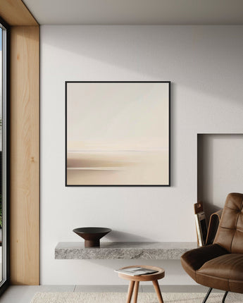
Explore Peaceful Purity here and let it enhance your space with its subtle beauty.
Create contrast with bolder artwork
If you want to create a more dynamic interior, consider choosing artwork that offers a strong contrast to the neutral tones in the room. A painting with darker or more colorful elements can add visual interest to the room and act as a focal point. However, it's important to maintain balance; too much contrast can disrupt the calm feeling that neutral colors usually give. By limiting contrasting artwork to one or two pieces, you can create an interesting yet cohesive interior.
Placement and framing
The placement of artwork is just as important as the selection itself. Larger artwork should be placed at eye level and centered on the wall to draw the eye to it. In rooms with neutral colors, consider choosing frames that either blend in with the wall color for a seamless look, or contrast to emphasize the artwork itself.
For a unified and harmonious feel, choose frames in the same color or material as other details in the room, such as furniture or textiles.
Final tip
When choosing art for a neutral-toned room, it’s important to consider how each piece of art interacts with the other elements in the room. The art should not only fit in, but also add something unique that enhances the overall aesthetic and feel of the room. By choosing the right piece of art, you can bring an otherwise calm and subtle room to life, creating a decor that is both elegant and timeless.
For more tips on how to integrate art into your interior design, check out our blog post Interior Design with Paintings in Neutral Colors: Style and Elegance .
Explore more artwork here: Artiley Canvas Prints .