
Working with tone-on-tone color palettes is a subtle and elegant way to create harmony in your home. By using similar color shades in both artwork and decor, you can create a cohesive and calm atmosphere, perfect for rooms where you want to promote relaxation and tranquility.
Why tone-in-tone works
Tone-on-tone color combinations work because they create a soft and harmonious impression. When you use different shades of the same color, you allow the eye to move through the room without interruption, creating a sense of continuity and coherence. This can be especially effective in rooms where you want to create a relaxing environment, such as a bedroom or living room.
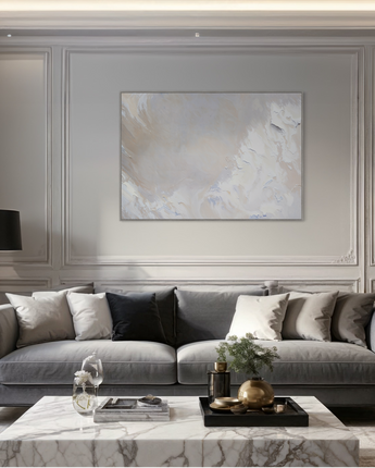
A canvas print that exemplifies this technique is our "Muted Elegance" . The print uses a palette of creamy and white tones with subtle touches of blue, creating an inviting atmosphere. Explore the print in more detail here: See "Muted Elegance" .
How to integrate tone-on-tone into your interior design
When choosing artwork to complement a tone-on-tone palette, consider choosing paintings that are the same main color as your walls, but in different shades. This creates a sophisticated layer of color that feels thoughtful and cohesive. Use accessories like pillows, rugs, and furniture in similar colors to tie the room together.
Read our blog post " How to choose the right colors for your canvas painting for the home " for more tips on how to work with colors in your home.